Competitive intelligence
What Should a Competitive Intelligence Dashboard Track?
Learn what a competitive intelligence dashboard should track to turn competitor changes into clear decisions, owners, alerts, and measurable outcomes.

A competitive intelligence dashboard should show the few changes and patterns that affect a recurring business decision. It should help a team answer what changed, why it matters, who owns the response, and what to do next—not display every metric available about every competitor.
What is a competitive intelligence dashboard?
For the operating model behind the dashboard, see our guide to building a competitive intelligence program.
A competitive intelligence dashboard is a shared view of relevant, dated information about competitors, markets, customers, and your own position. It combines observations from sources such as competitor websites, pricing pages, product documentation, changelogs, job pages, reviews, search research, and internal sales feedback.
The dashboard is not the same thing as a data warehouse or a collection of traffic estimates. Its job is to make a decision easier. The Strategic and Competitive Intelligence Professionals (SCIP) measurement guidance highlights timeliness, coverage, and the business impact of intelligence as useful measures. Those measures point to a practical rule: show enough context to act, but not so much data that the important signal disappears.
The distinction matters because a dashboard can be technically impressive and operationally useless. A dozen charts about estimated traffic may tell you less than one dated record showing that a competitor changed its enterprise packaging yesterday.
Start with decisions, not metrics
Before choosing a chart, write down the recurring decisions your team needs to make. For a SaaS company, those decisions might include:
| Recurring decision | Intelligence needed | Likely owner |
|---|---|---|
| Should we update our positioning? | Homepage headlines, audience language, proof points, and comparison claims | Product marketing |
| Should sales adjust a response? | Pricing, packaging, feature, and objection changes | Sales enablement |
| Should a roadmap item move up? | New integrations, capability claims, product pages, and launch signals | Product |
| Should we investigate a market shift? | Hiring patterns, partnerships, category pages, and customer language | Strategy |
| Should we refresh an SEO page? | New competitor pages, changed titles, content themes, and search intent | SEO or content |
If a proposed dashboard tile does not help answer one of these questions—or another question with a named owner—it probably belongs in an underlying research record instead.
Oppira’s recent dashboard analysis makes the same case in a useful way: use one tile per recurring decision rather than one tile per available metric. Its recommended starting point is six to ten tiles covering changes, publishing cadence, ads, pricing, reviews, share of the tracked set, and your own comparable numbers. That is a design starting point, not a universal quota.
The eight views worth considering
You do not need all eight on day one. Together, they form a practical menu for a small competitive intelligence dashboard.
1. Changes since the last review
This is usually the most valuable view. Show new, removed, and materially changed pages or sections since the previous review.
Useful columns include:
- competitor;
- page title and URL;
- change type;
- first detected time;
- previous and current values when available;
- confidence or evidence quality;
- impact priority;
- owner and next action.
Do not collapse all changes into one score. A new privacy-policy paragraph, a removed feature, and a rewritten pricing tier may all be “one change,” but they carry different consequences. Keep the raw observation visible and put interpretation in a separate field.
2. Pricing and packaging movement
Pricing pages often expose a competitor’s current commercial choices more clearly than an announcement does. Track plan names, displayed prices, billing intervals, seat limits, usage limits, free tiers, trial rules, add-ons, feature gates, and enterprise calls to action.
The comparison needs a date and a caveat. Public pricing may exclude negotiated enterprise contracts, regional taxes, discounts, or grandfathered plans. A good dashboard therefore says “publicly displayed price checked on September 10” rather than presenting the number as the competitor’s complete revenue model.
Use a table that makes the comparison auditable:
| Field | Competitor A | Competitor B | Your product | Last checked |
|---|---|---|---|---|
| Entry plan | Public value | Public value | Public value | Date |
| Annual equivalent | Normalized value | Normalized value | Normalized value | Date |
| Included seats | Value or unknown | Value or unknown | Value or unknown | Date |
| Key feature gate | Plan name | Plan name | Plan name | Date |
| Source | Pricing URL | Pricing URL | Pricing URL | Date |
Mark unknown values as unknown. Filling a gap with an estimate makes the dashboard look complete while making decisions less reliable.
3. Positioning and message changes
Monitor homepage hero copy, audience labels, category language, primary benefits, proof points, comparison pages, and calls to action. These changes are often more useful than a generic “brand sentiment” score because they show what a competitor is choosing to emphasize now.
For example, a shift from “simple website monitoring” to “enterprise competitive intelligence” may indicate a change in target buyer, even if the product itself has not changed. Treat that as an observed message shift first. The reason behind it is a hypothesis until other evidence supports it.
Record the exact wording or a short, faithful paraphrase, then link to the page. A dashboard summary without the underlying phrase is difficult to verify and easy to misinterpret.
4. Product, feature, and integration changes
Track new capability pages, changed feature descriptions, removed integrations, new use cases, documentation updates, and screenshots that reveal a meaningful workflow change.
Product pages can be early public signals. As Visualping’s competitor website analysis explains, pricing pages, product pages, homepages, career pages, and legal pages each reveal different kinds of strategic movement. A new integration page may support an active sales objection; a removed feature from a comparison table may deserve a product review; a new use-case page may reveal a segment the competitor is prioritizing.
Avoid treating every copy edit as a roadmap signal. Keep “copy changed,” “capability claim added,” and “feature visibly removed” as distinct change types.
5. Content and publishing cadence
Track new blog posts, resource pages, comparison pages, changelog entries, webinars, templates, and documentation releases. The useful metric is rarely the raw number of posts. Instead, look for themes, audiences, formats, and changes in cadence.
Ask questions such as:
- Is a competitor creating pages for a new buyer segment?
- Are several posts supporting one product launch?
- Did a comparison-page cluster appear around a category term?
- Did their publishing cadence change for a sustained period?
Use weekly or monthly aggregation for content unless a new page is directly relevant to an active launch or search opportunity. Record the page, audience, claim, evidence, and next action in a consistent format so the dashboard can link to a decision-ready source.
6. Hiring and organizational signals
Career pages can indicate investment areas, but they are leading signals—not proof that a product or strategy already exists. Track role families, seniority, geography, repeated skills, and changes in hiring volume.
For example, several enterprise account executive openings may support a hypothesis that a company is building a larger enterprise motion. Several roles mentioning a new technical area may justify closer monitoring of product pages. Neither observation proves a launch date, revenue plan, or successful execution.
Keep hiring data separate from confirmed product changes so a speculative interpretation cannot silently become a dashboard fact.
7. Reviews, customer language, and market context
Reviews and customer conversations can help explain why a competitor’s public changes matter. Track repeated themes, recent complaints, praised workflows, switching reasons, and language buyers use to describe the category.
Do not reduce this evidence to one sentiment number. A single score hides the text that a product or sales team needs to understand. Store representative excerpts with source, date, and context, subject to the source’s terms and privacy requirements.
Add market, news, partnership, and funding signals only when they connect to a decision. The MindTools overview of competitive intelligence groups useful research around strategy, current operations, perceptions, capabilities, and market prospects. That is a better organizing principle than adding every public data source to one screen.
8. Your own comparable numbers
A competitor dashboard can become an exercise in watching other companies while ignoring your own position. When comparison is meaningful, show your own corresponding data next to the competitor view: your public price, page coverage, publishing cadence, response time, win-loss theme, or product proof.
Keep definitions identical. If competitor traffic is an estimate and your traffic is a first-party analytics count, do not put them in one chart without clearly labeling the difference. Modeled external estimates and observed internal data answer different questions.
What not to put on the dashboard
The fastest way to make a dashboard unusable is to treat it as a warehouse dump. Leave these items out of the main view or label them carefully:
- Unexplained modeled estimates. Estimated traffic, ad spend, market share, and intent may be useful for research, but they should not look like observed facts.
- Metrics without an owner. If nobody is responsible for investigating movement, the tile will become background noise.
- Alerts duplicated as charts. If a high-priority pricing change already creates an alert, the dashboard should link to the evidence and action rather than create a second unread notification.
- Vanity totals. Total followers, total posts, or total monitored pages rarely support a decision by themselves.
- Unbounded competitor lists. A dashboard with fifty loosely relevant companies creates more scanning work than intelligence.
- Single composite scores. A “competitive threat score” hides the evidence and gives false precision unless its inputs, weighting, and confidence are transparent.
Oppira calls this the modelled-number trap: figures inferred from panels or estimates can lose their caveat as they are copied into meetings. If you keep one, label it directly on the tile as an estimate, include the method and date, and do not mix it with first-party observations.
How often should a competitive intelligence dashboard refresh?
Collection frequency and reading frequency should be different. Collect important evidence often enough to preserve history, but ask humans to review it at the cadence of the decision.
| Signal | Suggested collection | Suggested human review |
|---|---|---|
| Public pricing and plan limits | Daily | On change, then weekly review |
| Homepage positioning | Daily or several times per week | Weekly |
| Product and integration pages | Several times per week | Weekly or when a relevant change appears |
| Blog and resource hubs | Daily collection | Weekly |
| Career pages | Weekly | Monthly or when a clear pattern appears |
| Reviews and customer language | Weekly or monthly | Monthly |
| Market, partnership, and funding events | Continuous alerts or weekly collection | Weekly or monthly |
These are operating defaults, not laws. Visualping recommends more frequent checks for pricing pages and less frequent monitoring for content pages, while Oppira separates daily collection from a weekly reading rhythm. The right schedule depends on how quickly the signal changes and how expensive a missed change would be.
Build the dashboard in five steps
Step 1: Freeze the initial competitor set
Start with three to five direct competitors that repeatedly appear in customer conversations, sales opportunities, or product decisions. Record why each company is included. Add indirect competitors later when they answer a specific question.
Step 2: Define the evidence contract
For every signal, specify the source types allowed, the fields to capture, the freshness requirement, and what counts as a meaningful change. Include the page URL, detection date, previous state, current state, and confidence.
This prevents a dashboard from combining official pricing with an unsourced forum claim as if they were equivalent evidence.
Step 3: Create one tile per recurring decision
Choose the smallest number of views that can support the decisions you listed. Start with a changes feed, pricing movement, product or positioning changes, and an action queue. Add content cadence, hiring, reviews, or market context only when a real user will review them.
Step 4: Assign routing and ownership
Define where each change goes:
| Change | First destination | Follow-up |
|---|---|---|
| Pricing or packaging | Product marketing and sales | Refresh battlecard or pricing comparison |
| New feature or integration | Product | Validate capability and roadmap relevance |
| Homepage or comparison claim | Marketing | Review positioning and proof |
| New content cluster | SEO or content | Compare intent and internal-link opportunity |
| Hiring pattern | Strategy | Track as a hypothesis until corroborated |
The dashboard should show the owner and due date, not just the observation. This is how a research surface becomes an operating workflow.
Step 5: Review, prune, and measure
Run a short weekly review. Remove tiles that have not influenced a decision, adjust noisy monitoring rules, and record which actions were taken. Measure time to detect, time to distribute, evidence coverage, owner response, and adoption.
SCIP’s measurement guidance also points toward outcome measures such as the impact of avoiding a disruption or improving a decision. Use those as directional evidence rather than claiming that one dashboard alert caused a revenue result.
How Ryvalise fits into the workflow
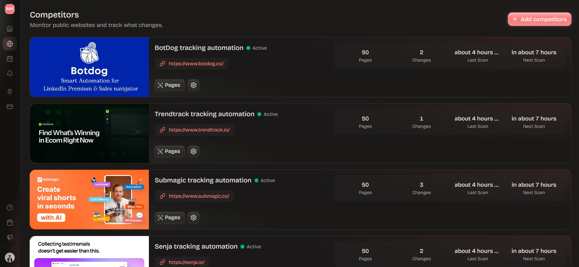
Ryvalise is most useful at the evidence and change-detection layer of this system. It can crawl a bounded set of same-origin competitor pages, discover page types, preserve source snapshots, and surface meaningful changes across pricing, product, positioning, content, and other high-signal pages.
The dashboard layer should then answer the operational questions: which change matters, who should see it, what remains uncertain, and what action was taken. That separation keeps observed page changes distinct from the interpretation built on top of them.
For a complete operating loop, combine the dashboard with a competitive intelligence program and a practical competitive intelligence report. The program defines the question and owner; the report turns reviewed evidence into a usable answer.
Frequently asked questions
What should a competitive intelligence dashboard include?
A strong starting dashboard includes meaningful competitor changes, pricing and packaging movement, positioning and product updates, content patterns, owners, source links, dates, and next actions. Add other views only when they support a recurring decision.
How many competitors should a dashboard track?
Start with three to five direct competitors that affect current customer, sales, product, or marketing decisions. Expand the set when a new company answers a defined research question, not simply because it is visible in the market.
How often should competitive intelligence data be updated?
Collect fast-moving signals such as pricing and key page changes daily or whenever a change occurs. Review the dashboard weekly, and use slower cadences for reviews, hiring patterns, and broader market context.
What is the difference between a competitive intelligence dashboard and an SEO dashboard?
A competitive intelligence dashboard covers competitor strategy, products, pricing, messaging, customer signals, and market movement. An SEO dashboard focuses on search visibility, rankings, clicks, impressions, links, and technical performance. They can share content and search evidence, but they answer different decisions.
How do you measure whether a competitive intelligence dashboard works?
Measure detection time, distribution time, evidence coverage, owner response, dashboard adoption, actions taken, and unanswered questions. Connect these measures to win rate, cycle time, or product outcomes carefully because many factors influence business results.

Mehdi Khoudali
Founder, Ryvalise
Book a demo
Let’s make competitor monitoring useful for your team.
A relaxed 20-minute conversation to understand your workflow, show you Ryvalise, and answer anything before you get started.
We can talk about
- Your monitoring priorities
- Setting up your first competitor
- How alerts fit your workflow
Pick any time that works for you. You’ll get a calendar invite with the call details.